

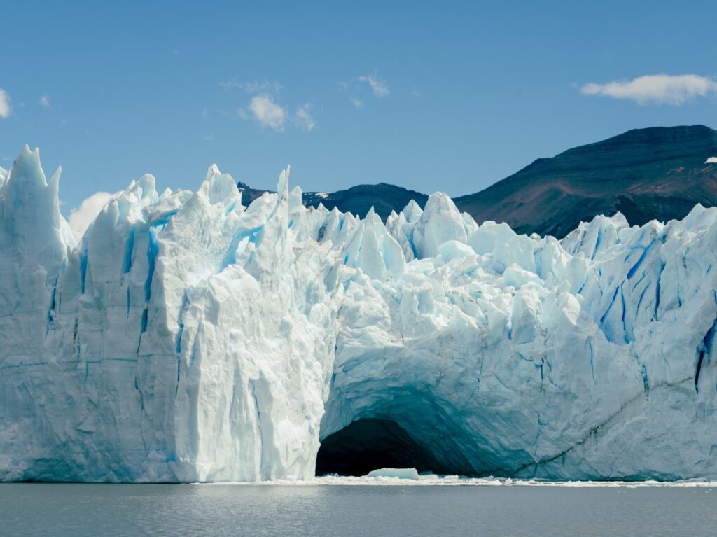
Some places stay with you as stories, and some stay with you as smells, but Patagonia stayed with me as colors. I remember the milky turquoise of the glacier water, the dark green of the beech forests and the gold of the grass at dusk, when the wind finally calmed down long enough to let me stand still. And I remember the pink that spread across the mountains right before sunrise, which I only saw because I was too cold to sleep anyway. Nature was rewarding my suffering, and I appreciated the gesture!
Months after I got home, I couldn’t stop thinking about those colors, so I tried to mix them from memory.
Why paint colors instead of places?
I’m not a trained painter, and painting a mountain range well is hard. Painting a mountain range well enough to make you feel the wind is very, very hard. But mixing a single color was something I could try, and it turns out that one color, mixed just right, can bring a place back faster than a photo can.
It’s a little like smelling a perfume your grandmother used to wear: you don’t need to see her, because the scent does all the work, and a color can do that, too.
My Patagonia watercolor palette
I started with a basic student watercolor set and kept a page of swatches next to my travel photos, mixing and remixing until each color felt right (not looked right, but felt right). Some colors took twenty tries, and one took an entire Sunday and most of a pot of coffee.
Glacier blue. This is a soft turquoise with lots of water and a touch of white gouache, to get that milky, almost chalky look glacier water has from all the ground-up rock.
Beech green. I used a deep green with a little burnt umber mixed in, so it feels like shade instead of a crayon.
Dusk grass. This is yellow ochre with the tiniest hint of orange, because too much orange makes it look like a pumpkin, so restraint is key.

Mountain pink. I mixed a rose with one single drop of violet, and I mean one, which I learned the hard way.
Granite gray. I mixed blue and brown together and never used black, because black straight from the tube looks flat and dead, while a mixed gray has life in it.
What I painted
I painted a few small landscapes, and they were fine, even charming if you squint. What surprised me, though, were the plain color studies, just blocks of each shade side by side on one page, with no mountains and no lakes, just rectangles. Those were the ones that brought it all back. Without me trying to show a mountain, the colors alone recalled the cold air, the wind that never stopped and that long, slanting light at the bottom of the world. I stuck that page on my fridge, and every time I open it for oat milk, I’m a little bit in Patagonia.
The best part was showing the page to my husband, who had been on the trip with me. He pointed at the dusk grass swatch and said, “That’s the evening we got lost walking back,” without me saying a single word. Same colors, same memory, two people, and I nearly cried into my paint water.
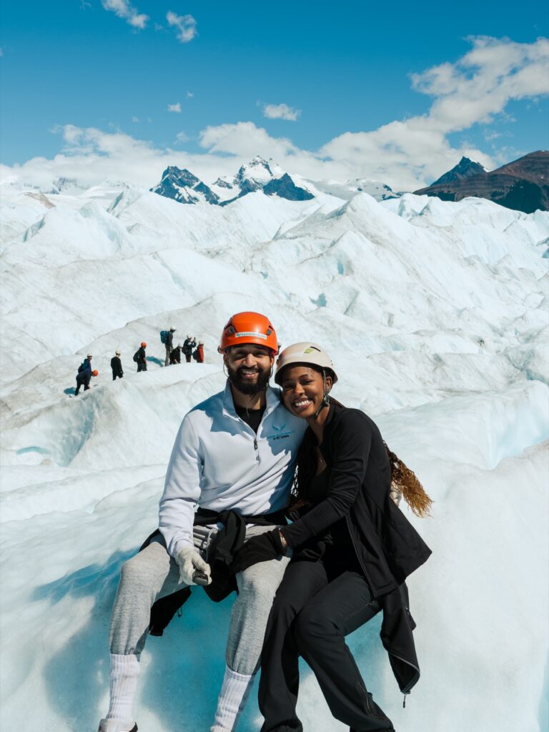
Memory isn’t only pictures. Sometimes it’s a color you can’t stop mixing until you get it right.
How to make a memory palette of your own
Pick a place you love. It doesn’t have to be far away, because your grandmother’s kitchen counts, and so does the beach you went to every summer as a kid.
Write down five colors you remember. Be specific, so instead of “blue,” write “the blue of the pool at the motel in July,” because the more specific the memory, the better the color.
Mix them on one page. Use whatever you have, whether that’s watercolors, gouache, colored pencils or even makeup if you’re desperate (I’m not judging), and keep mixing until it feels right.
Label each one with a memory. A word, a phrase or a date is enough, like “the light on the ferry,” “Grandma’s curtains” or “six a.m., too cold to sleep.”
Keep it somewhere you’ll see it. Put it on the fridge, on your desk or inside a journal, because it’s a souvenir you made yourself.
You might find that you’ve painted the whole place without painting it at all.
The same trip also left us obsessed with pumpkin pasta, which I wrote about in the pumpkin ravioli we kept ordering in Patagonia.
Did this one delight you? Tap the heart.
Did this one stay with you? I’d love to hear what you think.
Join the conversation (2 thoughts)


2 thoughts on “How to Paint a Place From Memory: My Watercolor Palette From Patagonia”
Is there a place you still think about in color? I’d love to know which colors you’d put in your palette.
Painting from memory instead of a photo is so freeing. Try it this week and tell me how it goes!